Flexible and natural
Start with FINE for an adaptable cinematic base, PURE for clean whites, or FLOURISH for softer daylight and skin.

Soft film-inspired colour and tactile grain for everyday photographs.
FINE brings together 15 variations in colour, contrast and texture. Its nostalgic character suits candid portraits, travel diaries and everyday scenes in natural light.
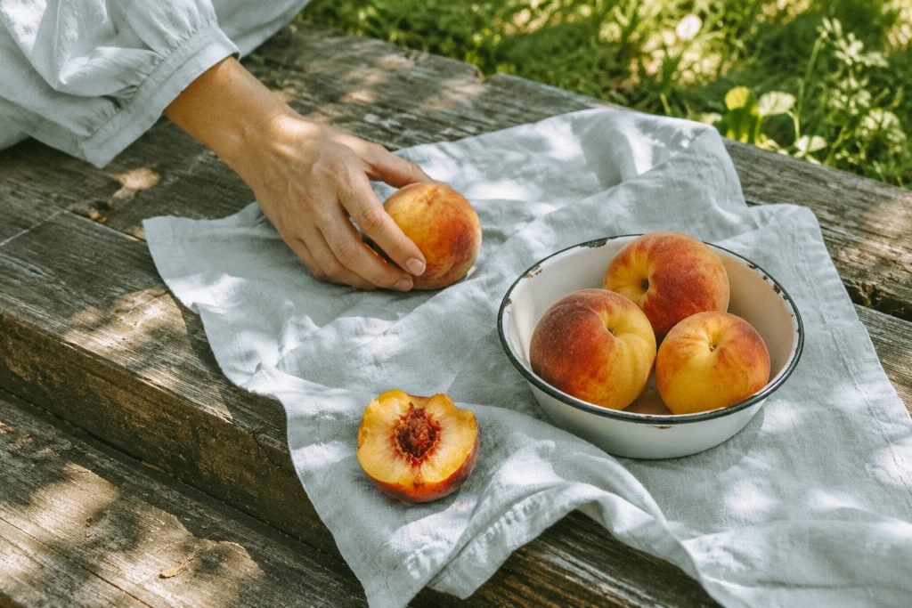
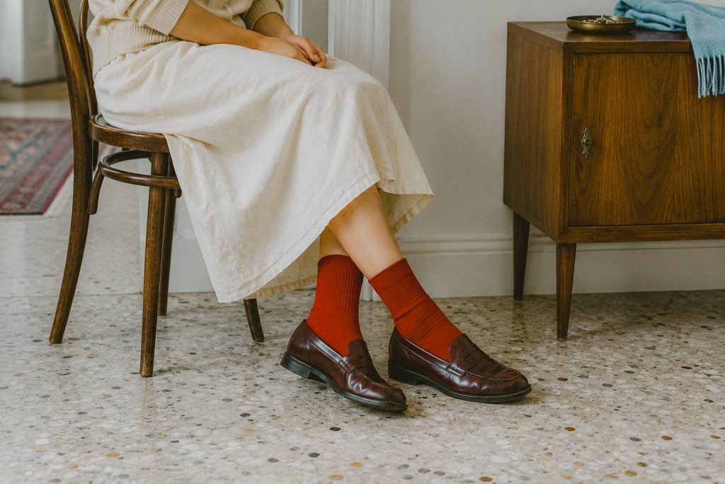


Analog color, soft detail, and visible grain.
Candid portraits · Everyday moments · Travel diaries · Landscapes in natural light
Nostalgic · Intimate · Cinematic
Exact colour reproduction · A completely texture-free finish
Balance brightness and preset Amount first. Then refine Grain to suit the photograph. Tap the selected Grain control again to open Size and Roughness, and check the exported image at its intended viewing size.
Bold colour and deep shadows for neon-lit nights.
PRISM explores artificial light through 10 vivid colour variations. Neon signs, illuminated storefronts and wet reflections provide the colour and contrast that define the collection.


Electric blues, vivid pinks, and luminous reds shaped around the contrast of night.
Neon streets · Nightlife · Coloured reflections · Illuminated storefronts
Electric · After-dark · Atmospheric
Soft, neutral daylight edits · Accurate product and skin-tone reproduction · Scenes with little separation between light and shadow · Images with heavily clipped colored highlights
Try the preset, then lower Amount if coloured lights or skin feel too intense. Check bright signs and reflections before adding Saturation. Preserve their shape instead of chasing stronger colour.
Clean whites and restrained colour for bright, minimal scenes.
PURE offers four variations for pale interiors, simple compositions and neutral palettes. Cool-grey undertones and controlled contrast bring definition to fabric, surfaces and everyday details.
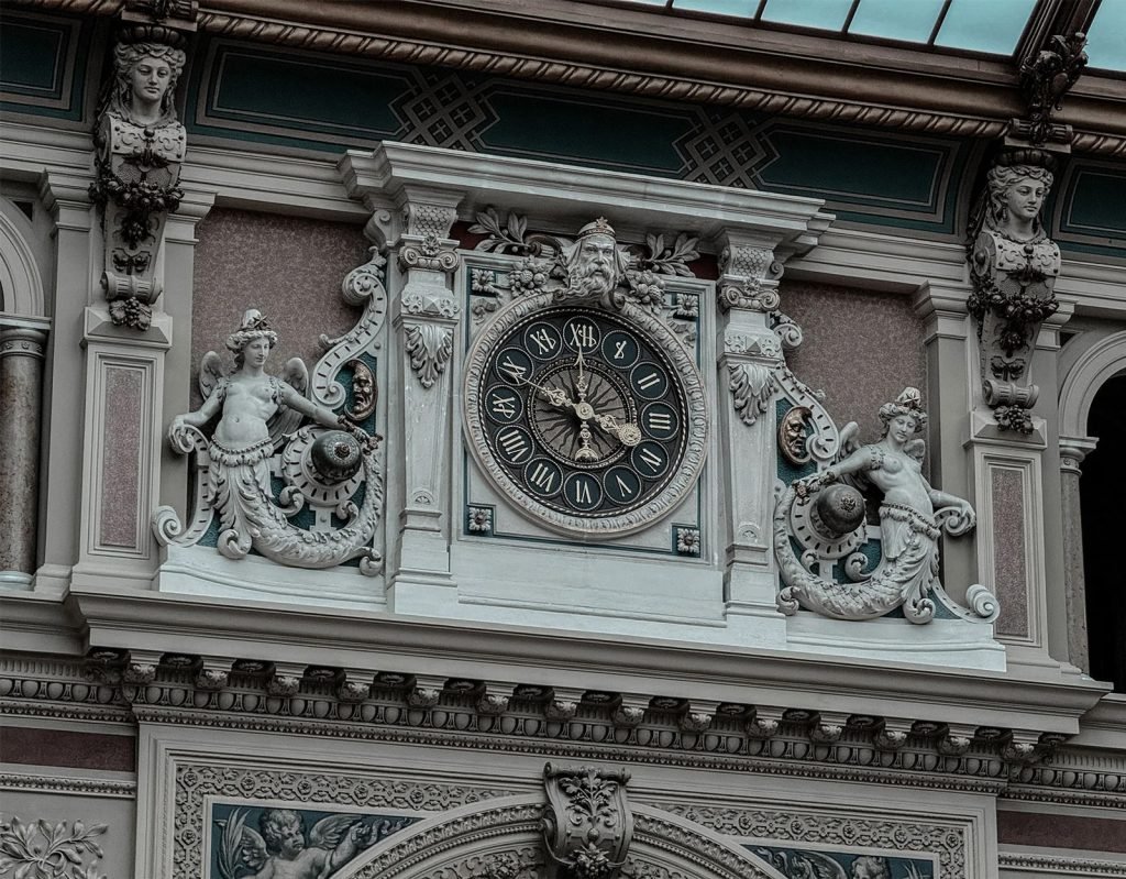


Clean whites, restrained color, subtle grey-blue tones, and crisp, controlled contrast.
Interiors in natural window light · Minimal lifestyle scenes · Products on simple backgrounds · Neutral outfits and editorial details
Clean · Minimal · Bright · Quiet · Modern
Dark scenes with limited available light · Strong neon and heavily saturated colors · Images where rich warmth is essential · Product photos requiring exact color reproduction
Check texture in white fabric and pale walls. Use Highlights to soften bright areas and Exposure when the whole photograph needs adjusting. If the result feels too cool, make a small change to Warmth.
Grain-forward black and white with deep shadows and a graphic edge.
MONO-X contains 10 black-and-white variations centred on shadow, silhouette and texture. It brings a darker, more graphic character to street scenes, architecture and documentary photographs.




Deep blacks, soft silver whites, visible grain, and a darker emotional finish.
Street · Architecture · Night · Documentary · Hard light
Raw · Graphic · Noir
A clean, texture-free finish · Scenes that depend on colour separation
Set Exposure and Contrast before refining Grain. Check smooth areas and shadow detail up close, then return to the full image. Reduce Grain when texture starts to compete with the subject.
Airy pastel colour for flowers, portraits and soft daylight.
FLOURISH offers six variations built around gentle colour and an airy finish. Floral scenes, pastel details and portraits in soft daylight provide a natural starting point.
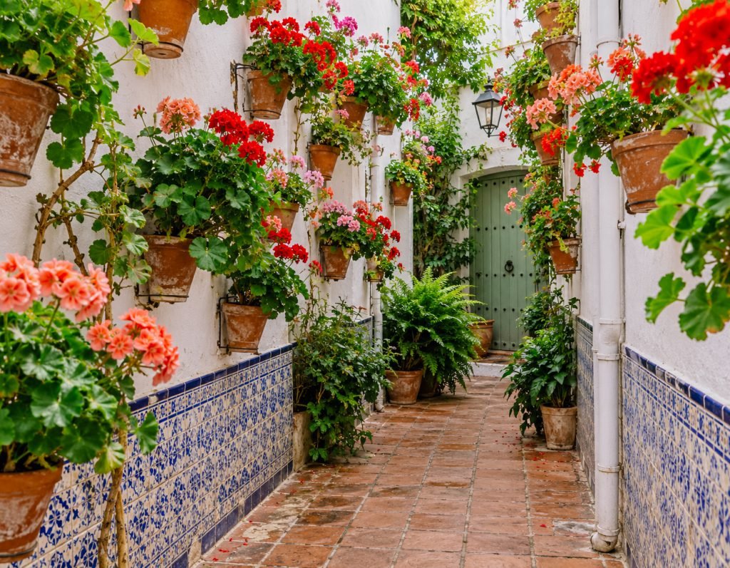
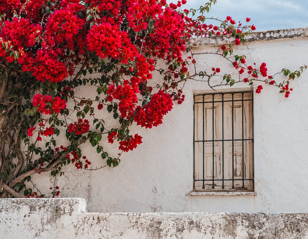
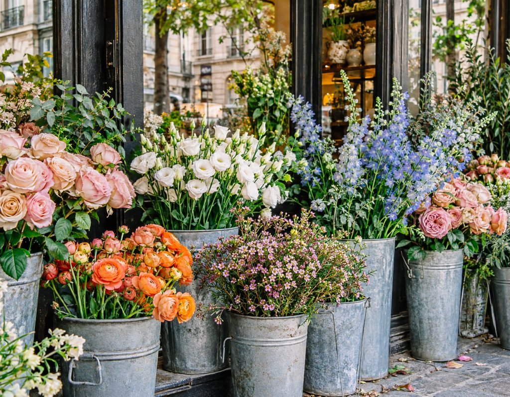
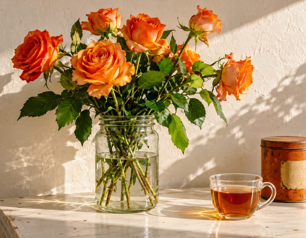
Soft pastel color, fresh floral tones, airy brightness, and gentle warmth for skin.
Flowers · Soft-daylight portraits · Pastel details · Window-lit still life
Fresh · Airy · Romantic · Gentle · Pastel
Very dark interiors · Scenes dominated by deep shadows · Neon and strongly colored artificial light · Images that need a hard, high-contrast finish
Check pale petals, skin and bright walls before increasing Exposure. If flowers or greens feel too strong, lower Amount first. Adjust Contrast gently when the image needs more definition.
Quiet winter colour with clean whites and subtle warmth.
WVIBES brings together six variations for snow, pale architecture and subdued seasonal colour. Cool-neutral shadows and gentle warmth balance winter’s quiet palette.
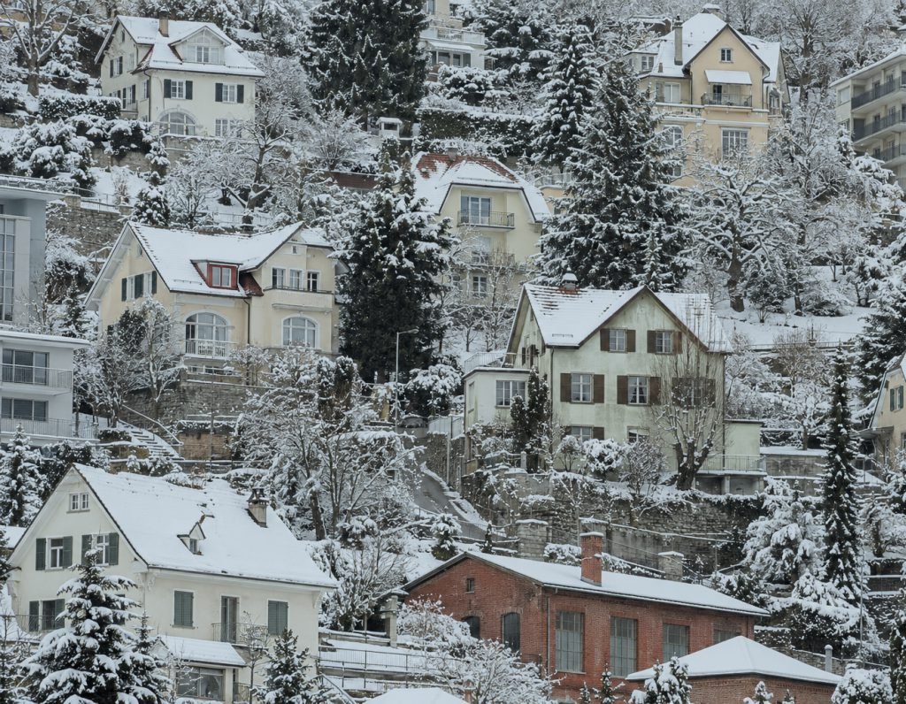


Clean whites, cool-neutral shadows, gentle warmth, and soft, defined contrast.
Snow-covered landscapes and forests · Winter streets and city architecture · Frost, pale skies, and snowy rooftops · Neutral interiors and window light · Simple outfits in white and muted tones
Quiet · Crisp · Wintry
Strong neon and heavily colored lighting · Very dark night scenes · Highly saturated tropical greens · Clipped highlights with little remaining detail
Balance Exposure while checking detail in snow. Lower Highlights gently if bright areas feel harsh, then adjust Warmth only as needed. Keep some coolness in the scene instead of making every white surface neutral.
Nuanced greys and classic contrast, shaped around light and form.
MONOCHROME includes 12 black-and-white variations for portraits, architecture and everyday observation. The collection explores the balance between dark tones, soft highlights and detail across the greys.




Rich blacks, soft highlights, nuanced gray tones, and classic film-inspired contrast.
Portraits · Architecture · Street scenes · Textured details
Timeless · Reflective · Sculptural
Scenes that rely on colour separation
Balance Exposure, then adjust Amount. Lift Shadows gently if important details disappear, or lower Blacks when the image needs a stronger anchor. Check pale surfaces before adding more Contrast.
Warm festive light and winter atmosphere, from day to night.
XMAS includes two Sun and two Moon variations. Sun offers a brighter starting point for daylight scenes, while Moon explores a deeper evening mood; either can be adjusted to suit the photograph.
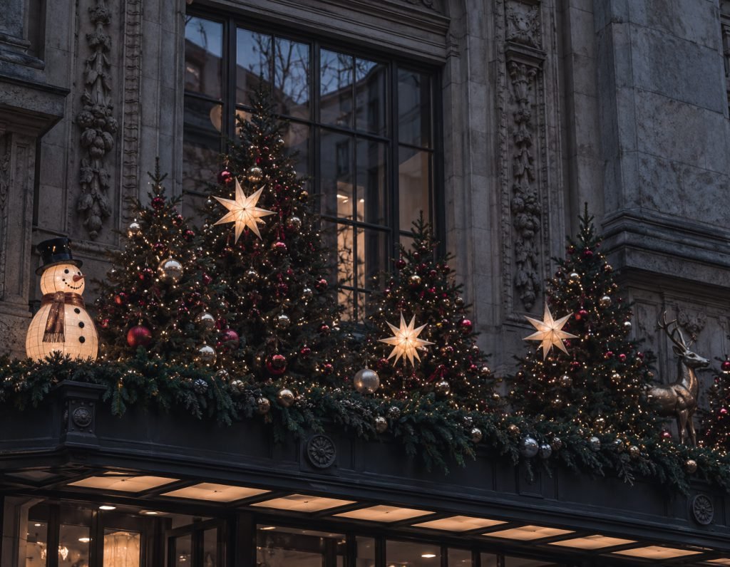
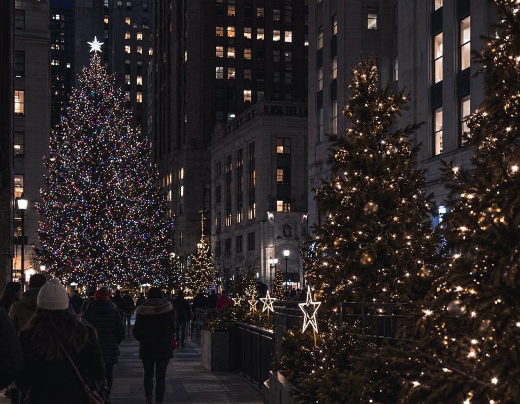
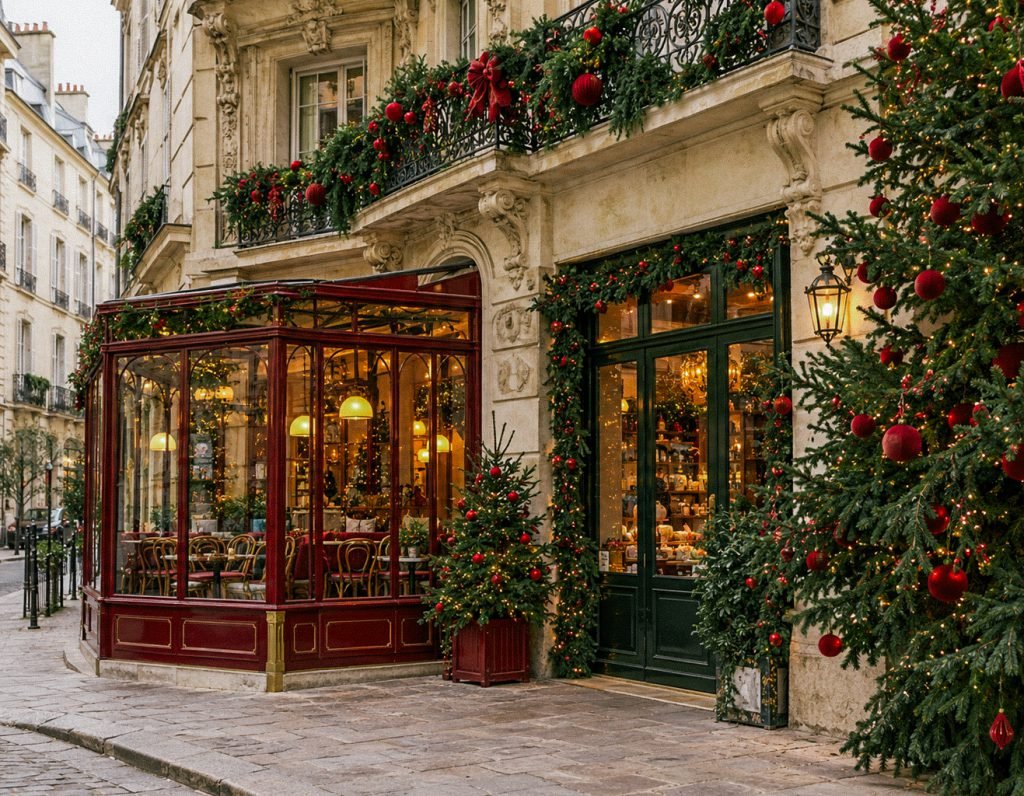

Warm highlights, clean winter whites, soft contrast, and rich festive colors.
Christmas markets and decorated streets · Christmas trees and festive shop windows · Cozy cafés and warm interiors · Winter city photography · Evening scenes with decorative lights
Festive · Cozy · Warm · Nostalgic · Cinematic
Exact neutral colour reproduction · Scenes with little visible light or colour detail
Choose Sun or Moon for the mood of the scene, then adjust Amount. Check faces, snow and illuminated decorations. Use Exposure for overall brightness and Highlights for bright areas that still contain detail.